
Menus
A Menu is an object created within an Application that provides the navigation between Screens. It can be attached to as many screens as needed, typically as the screen's header, and is edited over time as new screens are built in the model.
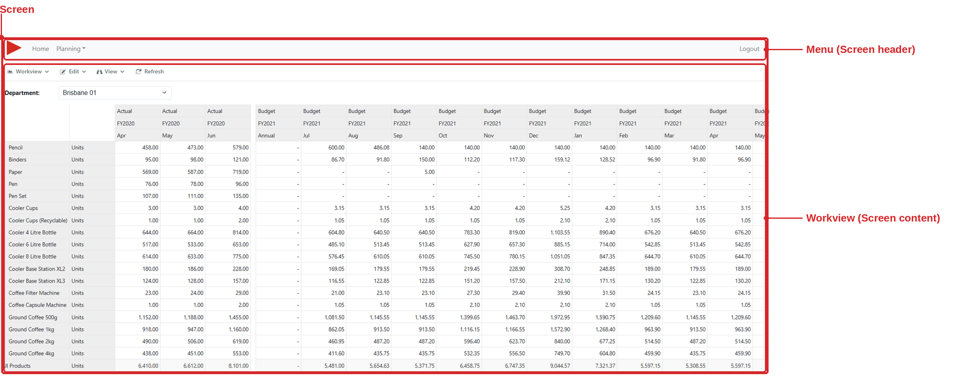
A Screen is made of a header, its page content, and a footer. The header and footer can each hold a Menu or a Custom Page - attaching the same Menu to every screen is what gives an application consistent navigation.
Building a Menu
The Menu Editor has two panels. On the left are the three sources you can draw items from; on the right is the Menu Structure, where items are dragged into the order you want.
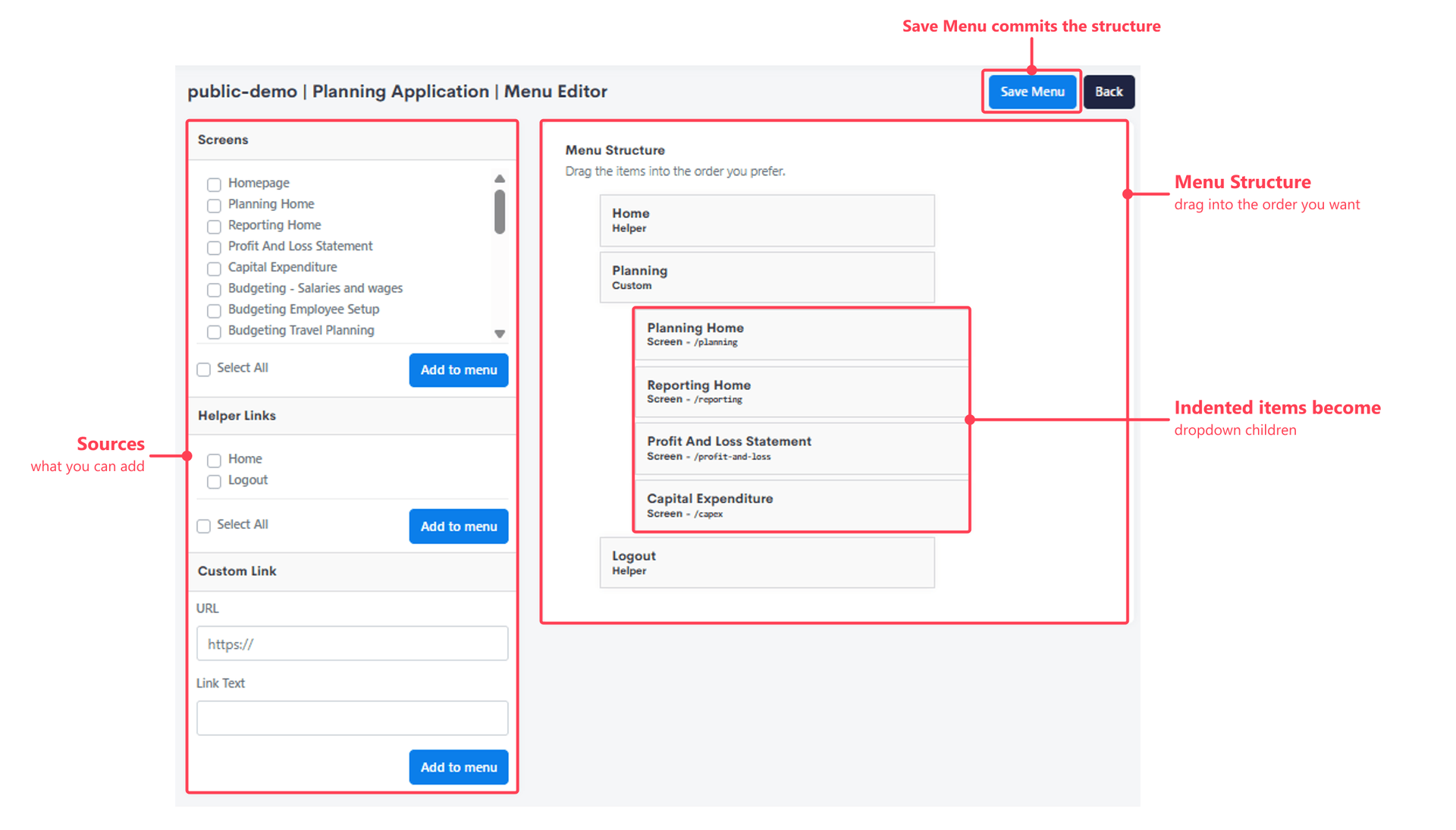
| Source | Adds | Shown in the structure as |
|---|---|---|
| Screens | One or more of the application's Screens, selected by checkbox. Select All adds every screen at once. | Screen - with the screen's route, e.g. /planning |
| Helper Links | Home and Logout - built-in destinations rather than screens you've defined. | Helper |
| Custom Link | An arbitrary URL, given a URL and Link Text. | Custom |
Each item is added with Add to menu, then dragged into position. Save Menu commits the whole structure.
Editing an item
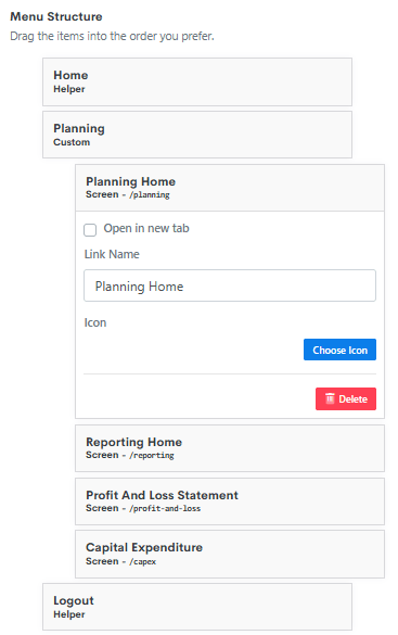
Clicking an item in the structure expands its properties.
| Property | Purpose |
|---|---|
| Link Name | The label shown to the user, independent of the screen's own name. |
| Icon | An optional icon, chosen via Choose Icon. |
| Open in new tab | Opens the destination in a new browser tab. |
| Link (Custom Link only) | The URL to navigate to. |
| Align to right | Pushes the item to the right-hand side of the bar - typically used for a sign-out or profile link. |
| Delete | Removes the item from the menu. |
Dropdowns
A Menu supports two levels. Indenting an item underneath another makes the outer item a dropdown, with its indented children revealed when the parent is clicked.
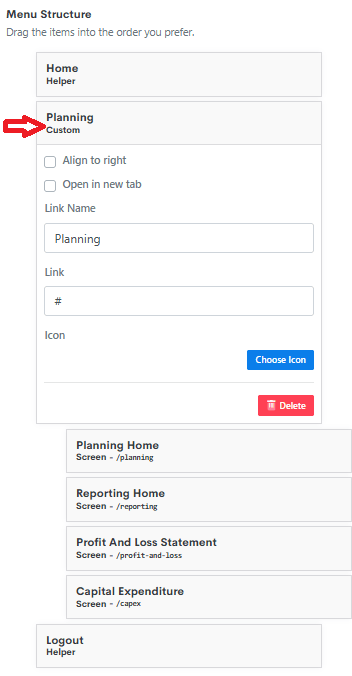
The parent is normally a custom link rather than a screen, because clicking a parent always opens its dropdown - it never follows its own link. This is done by giving the custom link a Link of #, so it has a label and an icon but no destination. In the example above, a custom link named Planning groups the Planning Home, Reporting Home, Profit And Loss Statement and Capital Expenditure screens beneath it.
A dropdown parent's own destination is effectively unreachable
Nesting under a Screen entry works, and the dropdown still opens as normal - but a left click on that parent opens the dropdown rather than navigating to the screen. The only way to reach the parent's own link is to deliberately open it, by right-clicking and choosing to open the link, or ctrl-clicking (cmd-click on Mac). If users need to get to that screen, give it its own entry in the dropdown as well.
Home and the initial landing page
The Home helper link doesn't point at a fixed URL. It resolves to whichever Screen in the application has the Is initial landing page flag set, configured on the screen itself.
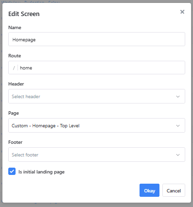
Only one Screen per application can hold this flag, and it determines what a user sees when they reach the application without a path:
| The user opens | They land on |
|---|---|
myinstance.modlr.cloud | The screen flagged as the initial landing page |
myinstance.modlr.cloud/screenpath/ | That specific screen, after signing in |
The second case matters for links shared into email or chat - a deep link survives the login redirect and delivers the user to the screen that was actually sent to them.
Appearance
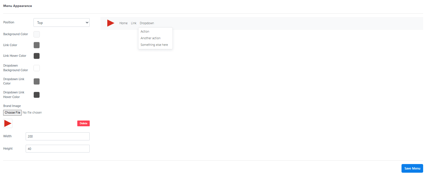
The Menu Appearance tab styles the menu, with a live preview alongside the controls.
| Setting | Purpose |
|---|---|
| Position | Where the menu sits on the screen, e.g. Top. |
| Background Color | The bar's background. |
| Link Color / Link Hover Color | Top-level item colour, at rest and on hover. |
| Dropdown Background Color | The background of an open dropdown. |
| Dropdown Link Color / Dropdown Link Hover Color | Item colour inside a dropdown, at rest and on hover. |
| Brand Image | A logo shown in the bar, uploaded with Choose File and sized with Width and Height. |
This is what lets an application carry a customer's branding without writing a custom page for the header.
Menus and access
A Menu doesn't grant access - it reflects it. An entry pointing at a Screen the user has no Access Tag for isn't shown to that user at all, so the menu renders differently depending on who is looking at it.
This is why the same Menu can be attached across an entire application whose users see different subsets of it: build the full structure once, and each user sees only the entries they can reach.
See Screen access vs. Instance security for how reaching a screen and seeing its contents are two different checks.
Other navigation
A Menu covers the navigation that should be available everywhere. Navigation from within a screen's content - clicking a row in a report to open its detail - is built separately:
| Route | Where it lives | Best for |
|---|---|---|
| Links on Cards | Card components, such as a Button | Contextual jumps from a report into related detail |
| Link To Another Workview Using Formula | A Workview's set instructions | Making row or column headers clickable, per element |
| Custom Pages | As a header or footer, in place of a Menu | Navigation a Menu can't express |
These are what turn a report into a drill path, and they can pass the clicked context through to the destination screen. See Navigating between screens for how the routes compare.
Related
- Screens - the pages a menu navigates between, and where a menu is attached
- About Applications - the object a menu belongs to
- Custom Pages - the alternative header/footer, for navigation a menu can't express
- Access Tags and Application Security - controlling which screens a user can reach