
Styles
WARNING
Styles are an advanced part of Cards. They give you direct access to CSS properties beyond what the standard component Properties panel exposes, and using them well benefits from some familiarity with CSS.
Every card editor gives you access to the Style Editor, where you can define named, reusable styles built from CSS attributes. Styles are scoped to the whole model, not the individual card - a style created while editing one card is immediately available to every other card in the model. Once defined, a style can be attached to any component through that component's Custom Style property.
Opening the Style Editor
In the card editor's top toolbar (File / Edit / View / Styles / Preview), click Styles.
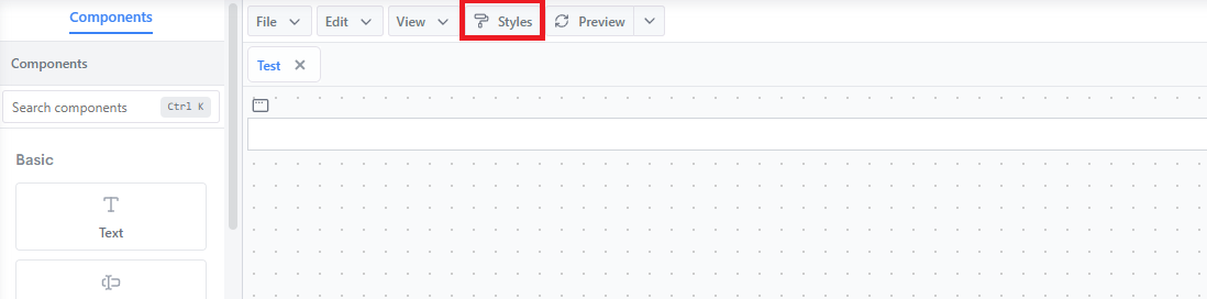
This opens the Style Editor, a three-panel view:
- Styles (left) - the list of styles available across the whole model, plus a search box and an Add Style button
- Attributes (middle) - the CSS attributes added to whichever style is selected
- Attribute detail (right) - the value editor for whichever attribute is selected
Import and Export (bottom left) let you move style definitions in and out of this library. Close exits the editor.
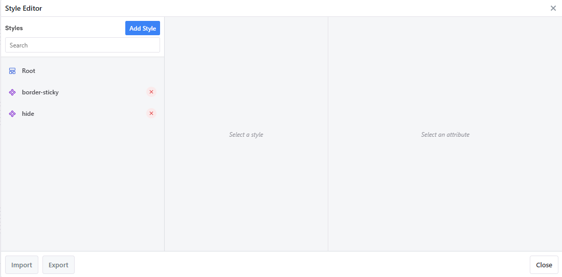
A Root entry is present by default, alongside any styles you've created with Add Style (e.g. border-sticky, hide above).
Building a Style
Click Add Style and give the style a name.
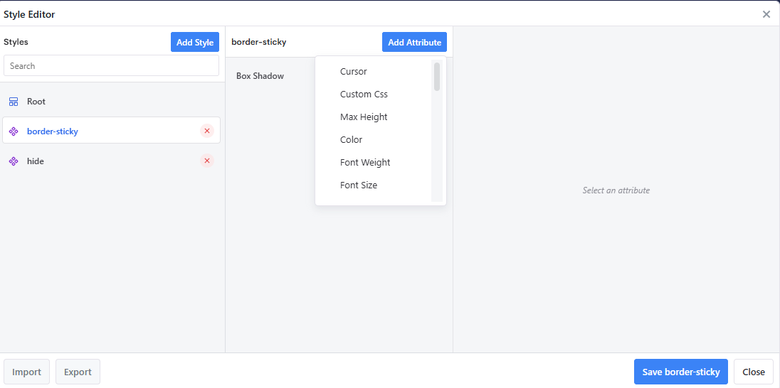
Select the style in the list, then click Add Attribute to choose a CSS attribute to configure. The list covers most common CSS properties:
Cursor, Custom Css, Max Height, Color, Font Weight, Font Size, Min Height, Background Color, Border Radius, Border Width, Font Family, Background Image, Border Style, Text Align, Height, Padding, Margin, Letter Spacing, Border Color, Line Height, Transition, Text Transform, Max Width, Width, Opacity, Min Width
Selecting an added attribute opens its detail panel on the right. Most attributes let you set a Value independently for the Default, Hover, Focus, Active, and Media states - e.g. a
Box Shadowattribute with aDefaultvalue ofinset 4px 0 0 #e5e7eb: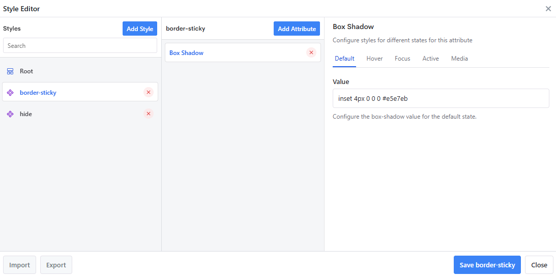
Click Save
<style name>to save that individual style. Each style is saved on its own, not the whole library at once.
Custom Css
Custom Css is a special attribute, flagged for advanced users, for anything the structured attribute list doesn't cover. Enter raw CSS declarations (property: value pairs, without a selector or braces) - the editor previews them wrapped in the style's own generated rule for context.
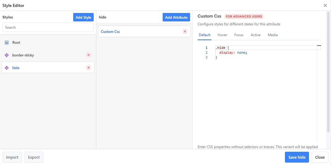
For example, a style named hide with a Custom Css attribute of display: none; produces a style that hides whatever component it's attached to.
Attaching a Style to a Component
Once a style is saved, select the target component (on any card in the model) and find Custom Style in the Styling section of its Properties panel. This dropdown lists the styles defined across the model - pick one to attach it. Because styles aren't tied to the card they were created on, you can build a style once and reuse it on any new card you create afterwards.
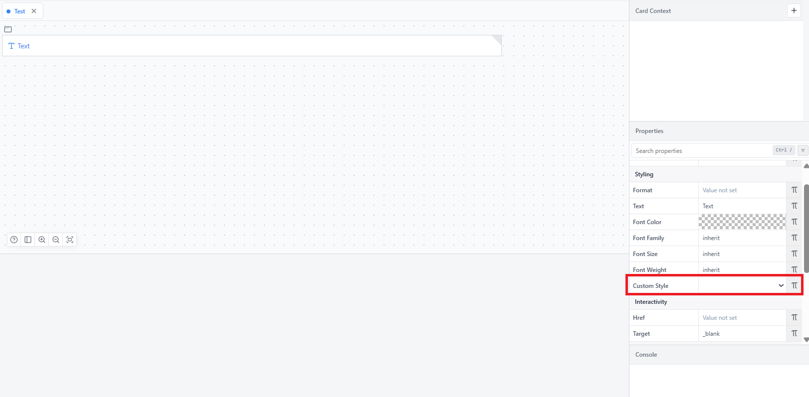
A Custom Style doesn't necessarily override the component's own properties (Font Color, Font Size, etc.) - it only takes precedence where an attribute genuinely clashes with one already set on the component. Its main use case is giving you access to CSS capabilities the standard Properties panel doesn't expose at all (box shadows, transitions, hover/focus states, raw CSS, and so on).
TIP
One practical use of a hide-style style: the Filtering and Sorting Tables guide uses a hidden Text component, styled with a display: none Custom Style, to feed a filterable column real cube data without displaying it.