
Making a Popup
In this guide we will walk through how to create a pop up and some useful additonal formatting features that can be added to it.
Only container components can be made into popouts.
This is done through the Container Type property under the Layout section.
Set this to "modal" and it will immediately become a popup.
We will cover the below features to style and add functionality to the popup:
- General Styling options
- Adding "Open" and "Close" buttons
General Styling Options
When a container is first made into a popup, if it is a new container component with no previous styling it will appear as a transparent container that causes a shadow over other content, like below. 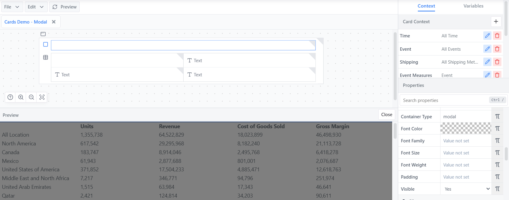
The highlighted container with the "Container Type" property set to "modal" is unstyled and appears as a transparent container casting a shadow.
The key properties to edit in order to style a popup nicely are as below:
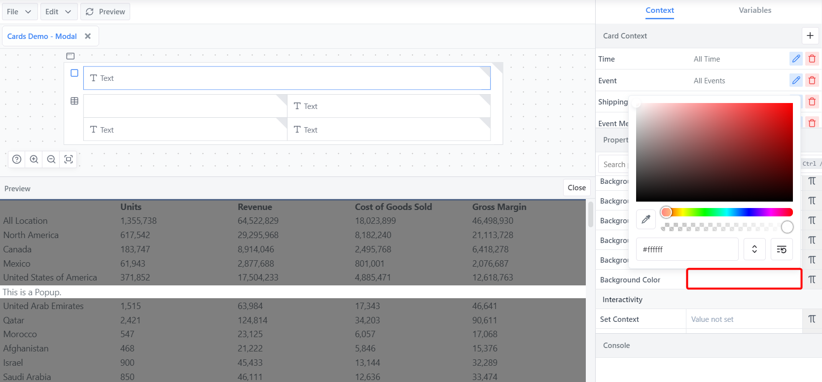
Background Color - Enables popup visibility and removes content overlap between the popup and the content below the popup.
Using the Background Color property under the Styling section, set the background colour as desired.
Click on the transparent checkered box to open the colour picker. You can drag around the colour picker, colour slider and transparency slider, or manually enter a hex code or RGBA value (Use the ↕️ Up-Down Arrow button to swap between the two). In the below example, we are using white (#ffffff).
INFO
If the popup outer container has no contents, it will not be visible even if the background colour is set.*
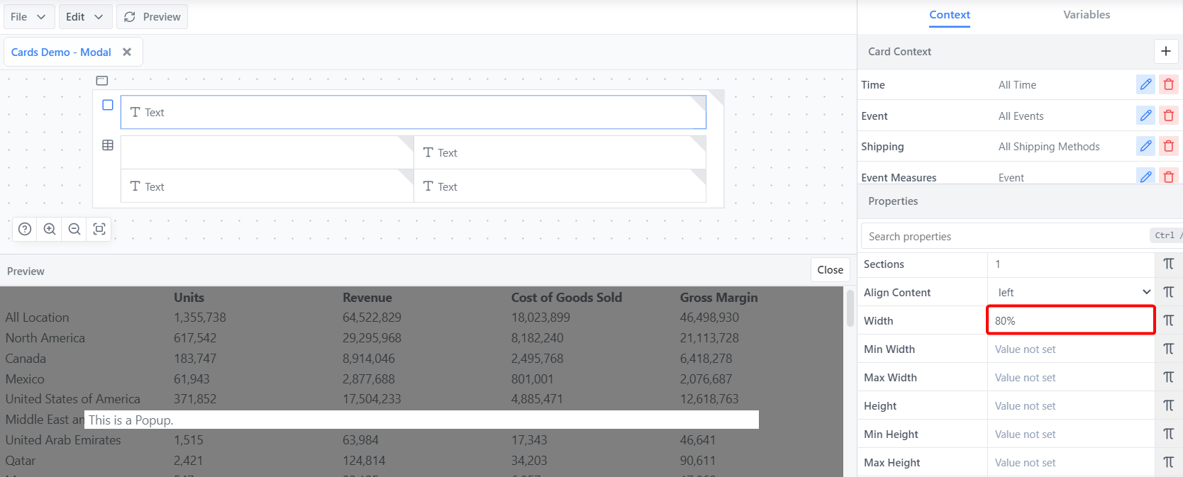
Width - Changes the width of the popup to allow it to appear as a more individual window.
- Using the Width property under the Layout section, set the width as desired. This will be a numerical number followed by the measurement.
INFO
The width property takes px, em, rem, %, vh and vw values. These measurement identifiers must be added to the end of the entered number (unlesss the number is 0).
In our example we have it set to 80% as to take up 80% of the parent container's width.
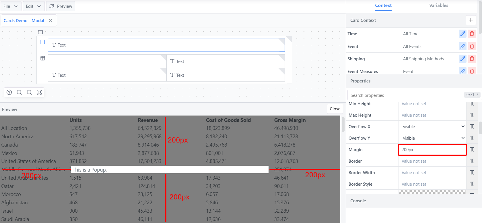
Margin - Enables the popup to be put in a different position on the screen (e.x. centered, top right, bottom left, etc.)
Using the Margin property under the Layout section, the popout's position can be adjusted.
Margin uses numerical values.
TIP
The margin property takes px, em, rem, %, vh and vw values. These measurement identifiers must be added to the end of the entered number(s) (unlesss the number is 0).
Consider margin as the space around the popup.
There are 3 different ways margin can be entered.
- One Value A single value defines the space around each side of the popup. If set to 0, the popup by default will center along the X axis. In below example, the margin is set to 200px. This adds 200px of margin around each side of the popup.
INFO
If the margin value exceeds the width of the popup, it will make the popup narrower as a result. The same is true for height.*
Two Values If two numerical values are entered, the first value will apply to the top and bottom sides, and the second value will apply to the left and right sides. If set to 0 auto, the popup will center along the X and Y axes.
Four Values If four numerical values are entered, they will apply in the following order. A good trick to remembering them is that they will apply clockwise starting from the top. Value 1 - The top side Value 2 - The right side Value 3 - The bottom side Value 4 - The left side
INFO
Remember that margin determines how much space is on each side outside of the popup container. So if value #2 for the right side is incremented, the popup will be pushed to the left.*
Other useful styling properties
- Padding - To add space around the content inside the modal
- Border properties - To add a border around the modal and round the modal's corners.
Adding "Open" and "Close" buttons
By default, a popup is always showing. However, it's ideal to have the option to open and close them and this can be easily achieving using Button components with variables. We will walk through the basic method to set this up.
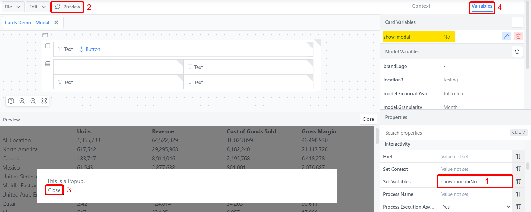
Drag a button into the popup container. This button will be our "Close" button to close the popup.
Select the button icon in the card editor panel to open the button properties. Under the Styling section, write
Closeinto the Text property.Under the Interactivity section, we are going to set a variable that determines whether the modal is open or not. In the Set Variables property, write
show-modal=No. This sets a new variable named "show-modal" to "No" when you click the button (ensure you click the preview button once you've changed the property to test it in the preview panel).TIP
Check the Variables panel to see your new variable appear and check the value it received.
Click on the popup container's icon in the card editor panel. In the properties panel, under the Layout section open the formula editor of the Visible property by clicking on the Pi icon.
In the formula popup, reference the variable by writing
VARIABLE("show-modal")and clicking the "Save" button. This will effectively set the Visible property to "No", which hides the container. Hit preview to see it in effect.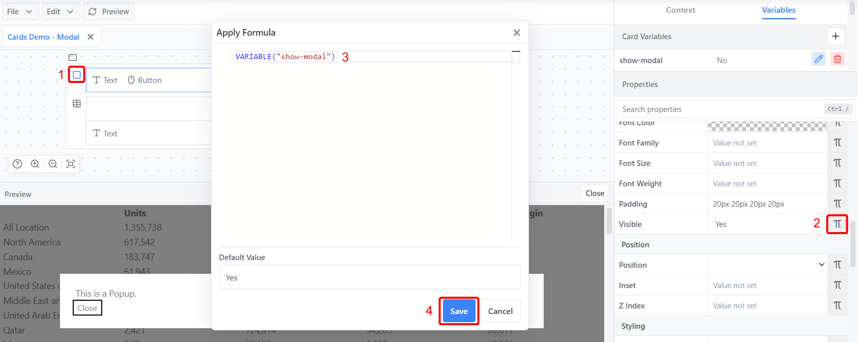
Add a new button component into the card outside of the popup container.
Follow steps 2-3 for the new button, but change two key properties:
- Set the Text property to "Open Popup"
- Set the Set Variables property to
show-modal=Yes
Hit preview and test the button. Now both the open and close buttons will be fully funtional.
The buttons and popups can be styled as desired and utilised in many different areas and scenarios.