
Adding a Table
In this guide we will go over the simple steps to add a Table into a new card.
- Open the card where the table is desired to be placed. In a new card, it is recommended to include context when the card is going to display data from a cube. Do so by Clicking the plus symbol in the top right of the Context Panel and selecting dimensions or cubes that may be referenced in the card, and clicking the blue "Select" button to confirm.
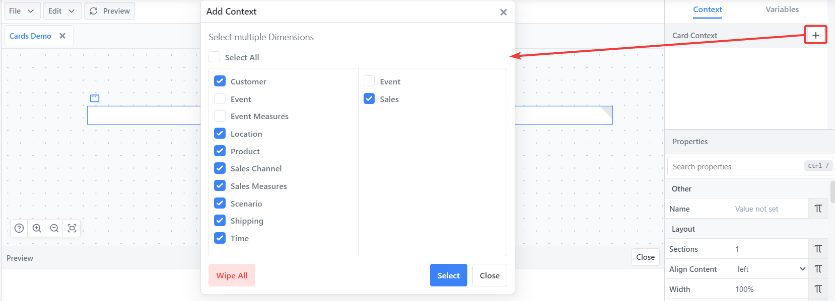
This is done so that the card can fall back on default context when required. (E.x. if a cube is being referred to but not all dimensions have specified elements, the context will be used for the unspecified elements.)
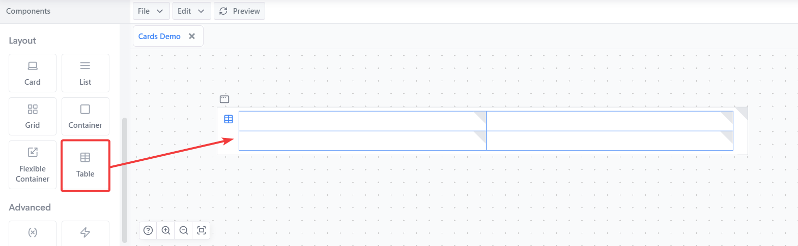
Under the "Layout" section of the "Components" panel on the left side bar, click and drag the "Table" component into the card editor panel. It will appear as a 2x2 grid.
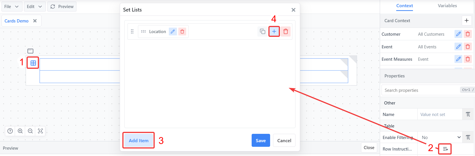
Click on the table component icon in the card editor panel to show the table properties in the Properties panel.
The two essential properties to be filled in for a table to function are the Row Instructions and the Column Instructions properties under the Table section. These two properties define the data the table is set up to display. The order which they are filled out does not matter, but we will begin with the Row Instructions. Click on the set editor icon to open the set editor panel for Row Instructions.
Click on the "Add Item" button on the bottom left to add a row for instructions. Click on the blue plus button in the new row to add a dimension. Choose from the dropdown, and click "Select" to confirm the selection.
Click on the pencil icon next to the dimension name to add dimension instructions. The elements selected here will define what shows on the rows of the table. In the example, we are selecting all locations from a "Location" dimension.
TIP
Choose elements from the left panel of the Popup. They can be added to set instructions by double-clicking on individual elements, or right clicking on an element for a dropdown menu of more methods to quickly add elements.
Once done, save the instructions using the blue "Save" button and save the Row Instructions property by clicking the blue "Save" button again on the set editor popup.
Steps 4-7 can be repeated for the Column Instructions.
INFO
New Rows and Column The table in the card editor will remain as a 2x2 grid at this stage. This is because the rows / columns automatically loop over all of the elements added in the instructions. To add new rows or columns that refer to different elements, in the Row Instructions or Column Instructions properties click the green "Add" button. A new row will appear in the set editor that can have dimensions added to it. Adding instructions in these new rows will make extra cells appear on the card editor table to correspond with the newly added rows/columns.
Dimensions and rows can be dragged into different positions using the left most grid icon of the elements in the set editor.
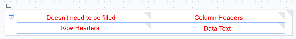
Once all instructions properties have been filled out, we need to add content to the table. The grid shown in the card editor panel can be broken down by cells to determine what text should be placed where: • Left column: Row Headers • Top Row: Column Headers • Remainder: Data cells
 Order of adding text elements to the different cells does not matter. We will start with the row headers.
Text components can be dragged into the corresponding cells and edited via their properties, but there is a simpler method with tables. Simply right click in the "Row Headers" cell and select "Insert Element Text".
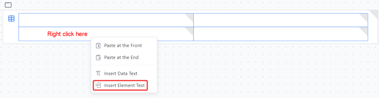
The dimension selected in the dropdown should typically be the one that was used in the Row Instructions. In this example, the "Location" dimension. This automatically puts the formula of
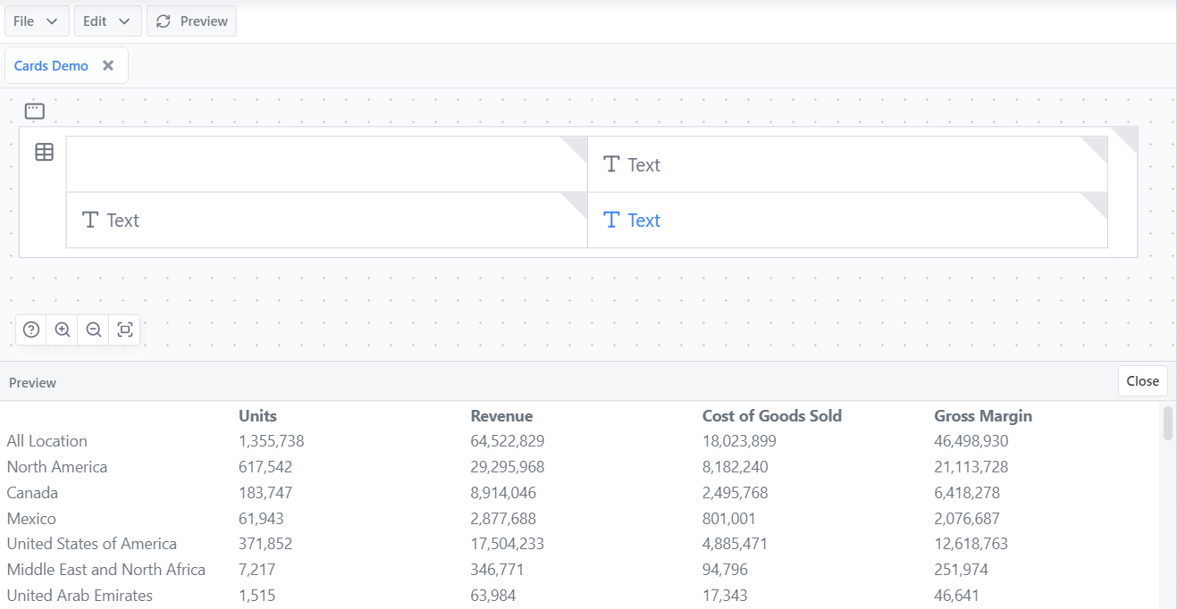
ELEMENT("Location")into the Text property of the Text component. With this in place, the text element will automatically retrieve the name of each "Location" element put in the instructions and use each of them as row headers. Click the "Preview" button above the card editor to see the new row headers appear in the card preview.Steps 9-10 can be repeated for column headers.
For the data cells, right click and select "Insert Data Text".
In the popup that appears, select the cube which references the data locations that are desired to be displayed in the table. Click select to confirm the selection.
Specific elements can be selected in the Location adjustments for the data reference. If all Location Adjustments are unchecked, the reference will fall back on the context where elements are not specified in the Row or Column Instructions of the table.
TIP
The "Format" dropdown in the popup will determine how numbers are formatted. The format can be changed in the "Format"
Hit the preview button and the basic table will appear in the card preview panel.
For more information on table components see the Table Component Documentation.